 تكلم مع الذكاء الاصطناعي
Deck 9: Implementing Responsive Design
ملء الشاشة (f)
سؤال
سؤال
سؤال
سؤال
سؤال
سؤال
سؤال
سؤال
سؤال
سؤال
سؤال
سؤال
سؤال
سؤال
سؤال
سؤال
سؤال
سؤال
سؤال
سؤال
سؤال
سؤال
سؤال
سؤال
سؤال
سؤال
سؤال
 Referring to the figure above, the code shown in the figure represents
A) print styles.
B) a media query.
C) a shim.
D) a schema.
سؤال
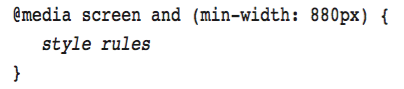 Referring to the figure above, the word min-width represents a
A) media type.
B) media feature.
C) media query.
D) logical operator.
سؤال
سؤال
سؤال
سؤال
 Referring to the figure above, the word screen represents a
A) media type.
B) media feature.
C) media query.
D) logical operator.
سؤال
سؤال
سؤال
 Referring to the figure above, which of the following describes when the code applies?
A) on a device with a screen and with a minimum width of 880px
B) on a device with a screen or with a minimum width of 880px
C) on a device with a screen and with a maximum width of 880px
D) on a device with a screen or with a maximum width of 880px
سؤال
سؤال
سؤال
سؤال
سؤال
 Referring to the figure above, the word and represents a
A) media type.
B) media feature.
C) media query.
D) logical operator.
سؤال
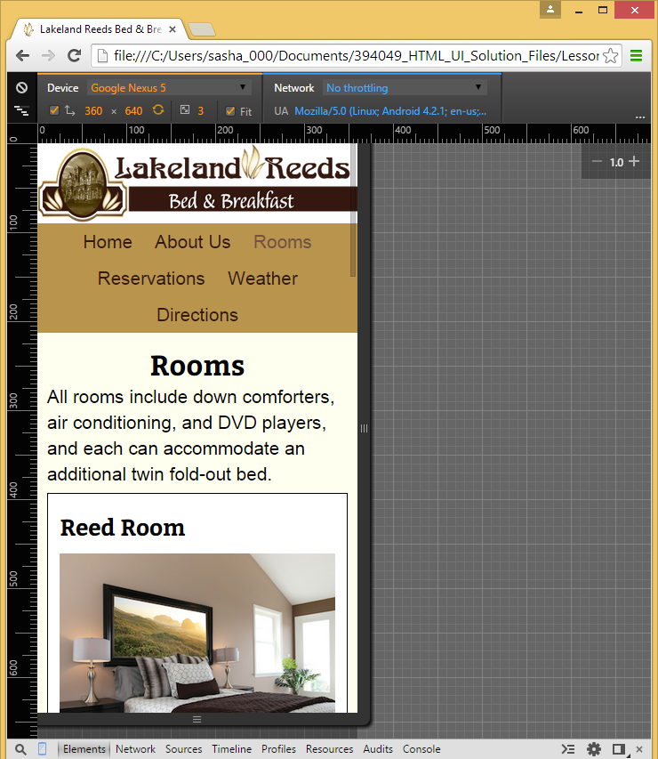
Referring to the figure above, which of the following aspects of responsive design does the figure show?
A) testing with an emulator
B) implementing a shim
C) progressive enhancement
D) responsive navigation
سؤال
سؤال
Referring to the figure above, what part of a responsive layout would this code accomplish?
A) create a small screen layout
B) add a sidebar
C) implement adaptive content
D) create a widescreen layout
سؤال
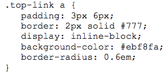
Referring to the figure above, the code that creates rounded corners starts with __________.
A) padding:
B) border:
C) display:
D) border-radius:
سؤال
سؤال
Referring to the figure above, which of the following aspects of responsive design does the figure illustrate?
A)adaptive content
B)testing with an emulator
C)implementing a shim
D)responsive navigation
سؤال
سؤال
سؤال
سؤال
سؤال
سؤال
Referring to the figure above, which aspect of responsive design does the figure illustrate?
A) responsive navigation
B) a widescreen layout
C) a shim
D) an emulator
سؤال
سؤال
سؤال
سؤال
سؤال
سؤال
سؤال
سؤال
سؤال
Match between columns
سؤال
سؤال
سؤال
سؤال
سؤال
سؤال
سؤال
سؤال
سؤال
سؤال

فتح الحزمة
قم بالتسجيل لفتح البطاقات في هذه المجموعة!
Unlock Deck
Unlock Deck
1/71
العب
ملء الشاشة (f)
Deck 9: Implementing Responsive Design
1
When a comma is used in a media query, the conditions before and after the comma must be true._________________________
False
2
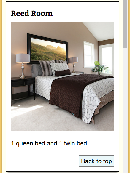
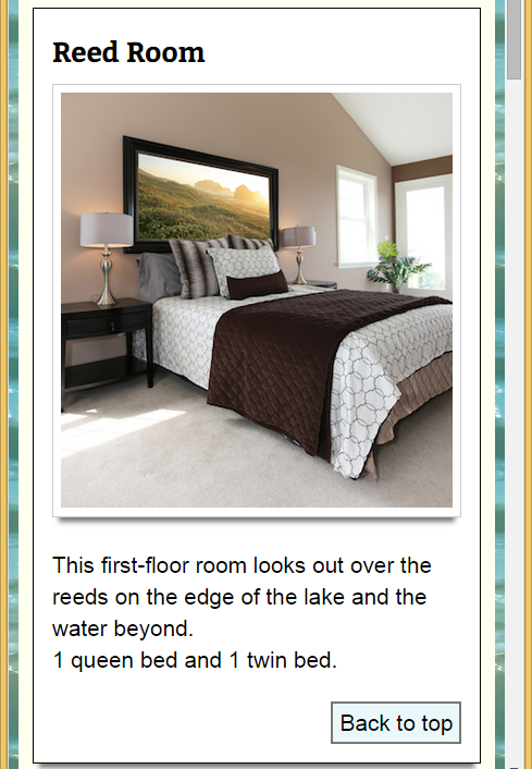
In many layouts, you want to specify a breakpoint at which the content height stops increasing._________________________
False
3
Responsive design allows a web developer to specify different HTML code for some or all of a page's elements._________________________
False
4
It's considered acceptable to incorporate a newer CSS feature not supported by older browsers as long as it doesn't affect the meaning or functionality of page content.
فتح الحزمة
افتح القفل للوصول البطاقات البالغ عددها 71 في هذه المجموعة.
فتح الحزمة
k this deck
5
Before making a website publicly available, it's important to test it on as many devices that your audience may be using as possible.
فتح الحزمة
افتح القفل للوصول البطاقات البالغ عددها 71 في هذه المجموعة.
فتح الحزمة
k this deck
6
Instead of testing on actual mobile devices, you can use an application known as a(n) emulator ._________________________
فتح الحزمة
افتح القفل للوصول البطاقات البالغ عددها 71 في هذه المجموعة.
فتح الحزمة
k this deck
7
Limiting the amount of content shown by default and making related information available if a user requests it is sometimes called responsive content. _________________________
فتح الحزمة
افتح القفل للوصول البطاقات البالغ عددها 71 في هذه المجموعة.
فتح الحزمة
k this deck
8
Responsive design relies mainly on the min-height and max-height media features.
فتح الحزمة
افتح القفل للوصول البطاقات البالغ عددها 71 في هذه المجموعة.
فتح الحزمة
k this deck
9
Specifying a background color as a fallback for a background image is an example of a shim.
فتح الحزمة
افتح القفل للوصول البطاقات البالغ عددها 71 في هذه المجموعة.
فتح الحزمة
k this deck
10
A browser on any device is capable of rendering any page written in HTML and CSS.
فتح الحزمة
افتح القفل للوصول البطاقات البالغ عددها 71 في هذه المجموعة.
فتح الحزمة
k this deck
11
Element widths in responsive designs are often specified in pixels ._________________________
فتح الحزمة
افتح القفل للوصول البطاقات البالغ عددها 71 في هذه المجموعة.
فتح الحزمة
k this deck
12
In general, you use the min-width media feature for all media queries when your starting layout is optimized for a small screen. _________________________
فتح الحزمة
افتح القفل للوصول البطاقات البالغ عددها 71 في هذه المجموعة.
فتح الحزمة
k this deck
13
An example of progressive enhancement is when you specify a fallback color for a background image. _________________________
فتح الحزمة
افتح القفل للوصول البطاقات البالغ عددها 71 في هذه المجموعة.
فتح الحزمة
k this deck
14
One method of implementing adaptive content is to change the display of elements in media queries using class names.
فتح الحزمة
افتح القفل للوصول البطاقات البالغ عددها 71 في هذه المجموعة.
فتح الحزمة
k this deck
15
To create a web page using responsive design, you start by creating a layout that's optimized for both the smallest and the largest screen size you want to support.
فتح الحزمة
افتح القفل للوصول البطاقات البالغ عددها 71 في هذه المجموعة.
فتح الحزمة
k this deck
16
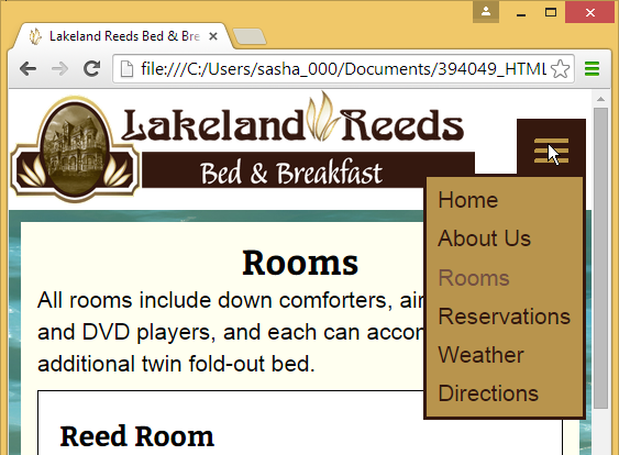
On smaller screens, it's standard to replace the nav bar with a button showing 3 horizontal lines.
فتح الحزمة
افتح القفل للوصول البطاقات البالغ عددها 71 في هذه المجموعة.
فتح الحزمة
k this deck
17
One of the most commonly hidden web page elements for smaller screens is the nav bar._________________________
فتح الحزمة
افتح القفل للوصول البطاقات البالغ عددها 71 في هذه المجموعة.
فتح الحزمة
k this deck
18
On small screens, it generally makes the most sense to display some content in a sidebar.
فتح الحزمة
افتح القفل للوصول البطاقات البالغ عددها 71 في هذه المجموعة.
فتح الحزمة
k this deck
19
A media query recreates a feature for older browsers using JavaScript code. _________________________
فتح الحزمة
افتح القفل للوصول البطاقات البالغ عددها 71 في هذه المجموعة.
فتح الحزمة
k this deck
20
You should never limit the amount of content shown by default on a smaller screen.
فتح الحزمة
افتح القفل للوصول البطاقات البالغ عددها 71 في هذه المجموعة.
فتح الحزمة
k this deck
21
When your default layout is optimized for small screens, then the media query for your first breakpoint would use the __________ media feature.
A) min-width
B) max-width
C) min-height
D) max-height
A) min-width
B) max-width
C) min-height
D) max-height
فتح الحزمة
افتح القفل للوصول البطاقات البالغ عددها 71 في هذه المجموعة.
فتح الحزمة
k this deck
22
Element widths in responsive designs are often specified in percentages, with the size of each element relative to
A) the width of the browser window.
B) the height of the browser window.
C) the width of its parent.
D) the height of its parent.
A) the width of the browser window.
B) the height of the browser window.
C) the width of its parent.
D) the height of its parent.
فتح الحزمة
افتح القفل للوصول البطاقات البالغ عددها 71 في هذه المجموعة.
فتح الحزمة
k this deck
23
Which of the following applies to a device with a screen or to a device with a minimum width of 500px?
A) screen and (min-width: 500px)
B) screen, (min-width: 500px)
C) screen and (max-width: 500px)
D) screen, (max-width: 500px)
A) screen and (min-width: 500px)
B) screen, (min-width: 500px)
C) screen and (max-width: 500px)
D) screen, (max-width: 500px)
فتح الحزمة
افتح القفل للوصول البطاقات البالغ عددها 71 في هذه المجموعة.
فتح الحزمة
k this deck
24
On small screens, it generally makes the most sense to display content
A) in a single column
B) in two columns
C) at a fixed width
D) in a sidebar
A) in a single column
B) in two columns
C) at a fixed width
D) in a sidebar
فتح الحزمة
افتح القفل للوصول البطاقات البالغ عددها 71 في هذه المجموعة.
فتح الحزمة
k this deck
25
Which of the following is a commonly hidden web page element?
A) nav bar
B) main heading
C) footer
D) all of the above
A) nav bar
B) main heading
C) footer
D) all of the above
فتح الحزمة
افتح القفل للوصول البطاقات البالغ عددها 71 في هذه المجموعة.
فتح الحزمة
k this deck
26
When creating a responsive design, you create a(n) __________ at a width where the layout no longer looks good, or where you'd like to move elements or add or remove content.
A) breakpoint
B) emulator
C) hamburger menu
D) shim
A) breakpoint
B) emulator
C) hamburger menu
D) shim
فتح الحزمة
افتح القفل للوصول البطاقات البالغ عددها 71 في هذه المجموعة.
فتح الحزمة
k this deck
27
Referring to the figure above, the code shown in the figure representsA) print styles.
B) a media query.
C) a shim.
D) a schema.
فتح الحزمة
افتح القفل للوصول البطاقات البالغ عددها 71 في هذه المجموعة.
فتح الحزمة
k this deck
28
Referring to the figure above, the word min-width represents aA) media type.
B) media feature.
C) media query.
D) logical operator.
فتح الحزمة
افتح القفل للوصول البطاقات البالغ عددها 71 في هذه المجموعة.
فتح الحزمة
k this deck
29
You use the @media keyword to create a media query for responsive design using which media type?
A) min-width
B) max-width
C)print
D) screen
A) min-width
B) max-width
C)print
D) screen
فتح الحزمة
افتح القفل للوصول البطاقات البالغ عددها 71 في هذه المجموعة.
فتح الحزمة
k this deck
30
If you placed two images side by side and assigned each a width of 45%, how much room would be left for the margin, padding, and border?
A) 5%
B) 10%
C) 45%
D) 100%
A) 5%
B) 10%
C) 45%
D) 100%
فتح الحزمة
افتح القفل للوصول البطاقات البالغ عددها 71 في هذه المجموعة.
فتح الحزمة
k this deck
31
When a media query uses the comma ( , ) logical operator,
A) the conditions before and after the comma must be true.
B) the condition before or after the comma must be true.
C) the condition following the comma must be false.
D) the condition following the comma must be true.
A) the conditions before and after the comma must be true.
B) the condition before or after the comma must be true.
C) the condition following the comma must be false.
D) the condition following the comma must be true.
فتح الحزمة
افتح القفل للوصول البطاقات البالغ عددها 71 في هذه المجموعة.
فتح الحزمة
k this deck
32
Referring to the figure above, the word screen represents aA) media type.
B) media feature.
C) media query.
D) logical operator.
فتح الحزمة
افتح القفل للوصول البطاقات البالغ عددها 71 في هذه المجموعة.
فتح الحزمة
k this deck
33
Before making a website publicly available, it's important to test on
A) as many devices that your audience may be using as possible.
B) every device that may access your website.
C) your computer.
D) your computer and a smartphone.
A) as many devices that your audience may be using as possible.
B) every device that may access your website.
C) your computer.
D) your computer and a smartphone.
فتح الحزمة
افتح القفل للوصول البطاقات البالغ عددها 71 في هذه المجموعة.
فتح الحزمة
k this deck
34
In a media query for responsive design, you follow the media type with one or more media __________, which specify conditions that the media must satisfy for the rules in the media query to be applied..
A) details
B) features
C) modes
D) values
A) details
B) features
C) modes
D) values
فتح الحزمة
افتح القفل للوصول البطاقات البالغ عددها 71 في هذه المجموعة.
فتح الحزمة
k this deck
35
Referring to the figure above, which of the following describes when the code applies?A) on a device with a screen and with a minimum width of 880px
B) on a device with a screen or with a minimum width of 880px
C) on a device with a screen and with a maximum width of 880px
D) on a device with a screen or with a maximum width of 880px
فتح الحزمة
افتح القفل للوصول البطاقات البالغ عددها 71 في هذه المجموعة.
فتح الحزمة
k this deck
36
To create a web page using responsive design, you start by creating a layout that's optimized for
A) the smallest screen size you want to support.
B) the largest screen size you want to support.
C) Both A and B
D) Either A or B
A) the smallest screen size you want to support.
B) the largest screen size you want to support.
C) Both A and B
D) Either A or B
فتح الحزمة
افتح القفل للوصول البطاقات البالغ عددها 71 في هذه المجموعة.
فتح الحزمة
k this deck
37
Responsive design allows you to specify different CSS style rules depending on
A) the height of the screen.
B) the width of the screen.
C) whether a device has a mouse.
D) whether a device has a touchscreen.
A) the height of the screen.
B) the width of the screen.
C) whether a device has a mouse.
D) whether a device has a touchscreen.
فتح الحزمة
افتح القفل للوصول البطاقات البالغ عددها 71 في هذه المجموعة.
فتح الحزمة
k this deck
38
Which property might you use with a media query to create columns?
A) float
B) font-weight
C) line-height
D) box-shadow
A) float
B) font-weight
C) line-height
D) box-shadow
فتح الحزمة
افتح القفل للوصول البطاقات البالغ عددها 71 في هذه المجموعة.
فتح الحزمة
k this deck
39
While developing a website, you can test how its layout might appear on a range of devices using
A) a shim
B) an emulator
C) a device-pixel ratio
D) a hamburger menu
A) a shim
B) an emulator
C) a device-pixel ratio
D) a hamburger menu
فتح الحزمة
افتح القفل للوصول البطاقات البالغ عددها 71 في هذه المجموعة.
فتح الحزمة
k this deck
40
Referring to the figure above, the word and represents aA) media type.
B) media feature.
C) media query.
D) logical operator.
فتح الحزمة
افتح القفل للوصول البطاقات البالغ عددها 71 في هذه المجموعة.
فتح الحزمة
k this deck
41
Referring to the figure above, which of the following aspects of responsive design does the figure show?
A) testing with an emulator
B) implementing a shim
C) progressive enhancement
D) responsive navigation
فتح الحزمة
افتح القفل للوصول البطاقات البالغ عددها 71 في هذه المجموعة.
فتح الحزمة
k this deck
42
Which of the following involves using newer CSS features in a way that doesn't affect the meaning or functionality of the page content?
A) a shim
B) progressive enhancement
C) an emulator
D) adaptive content
A) a shim
B) progressive enhancement
C) an emulator
D) adaptive content
فتح الحزمة
افتح القفل للوصول البطاقات البالغ عددها 71 في هذه المجموعة.
فتح الحزمة
k this deck
43
Referring to the figure above, what part of a responsive layout would this code accomplish?
A) create a small screen layout
B) add a sidebar
C) implement adaptive content
D) create a widescreen layout
فتح الحزمة
افتح القفل للوصول البطاقات البالغ عددها 71 في هذه المجموعة.
فتح الحزمة
k this deck
44
Referring to the figure above, the code that creates rounded corners starts with __________.
A) padding:
B) border:
C) display:
D) border-radius:
فتح الحزمة
افتح القفل للوصول البطاقات البالغ عددها 71 في هذه المجموعة.
فتح الحزمة
k this deck
45
Which pseudo-class selects the first child element of the specified type?
A) :first-child
B) :first-of-type
C) :nth-child
D) :nth-of-type
A) :first-child
B) :first-of-type
C) :nth-child
D) :nth-of-type
فتح الحزمة
افتح القفل للوصول البطاقات البالغ عددها 71 في هذه المجموعة.
فتح الحزمة
k this deck
46
Referring to the figure above, which of the following aspects of responsive design does the figure illustrate?
A)adaptive content
B)testing with an emulator
C)implementing a shim
D)responsive navigation
فتح الحزمة
افتح القفل للوصول البطاقات البالغ عددها 71 في هذه المجموعة.
فتح الحزمة
k this deck
47
What does a hamburger menu replace?
A) nav bar
B) logo
C) sidebar
D) footer
A) nav bar
B) logo
C) sidebar
D) footer
فتح الحزمة
افتح القفل للوصول البطاقات البالغ عددها 71 في هذه المجموعة.
فتح الحزمة
k this deck
48
Which pseudo-class selects the first child element if it is of the specified type?
A) :first-child
B) :first-of-type
C) :nth-child
D) :nth-of-type
A) :first-child
B) :first-of-type
C) :nth-child
D) :nth-of-type
فتح الحزمة
افتح القفل للوصول البطاقات البالغ عددها 71 في هذه المجموعة.
فتح الحزمة
k this deck
49
What is selected by the selector section p:first-of-type ?
A) the first p element within each section element
B) the first p child element within each section element if that p element is also the first child
C) the last p element within each section element
D) the last p child element within each section element if that p element is also the last child
A) the first p element within each section element
B) the first p child element within each section element if that p element is also the first child
C) the last p element within each section element
D) the last p child element within each section element if that p element is also the last child
فتح الحزمة
افتح القفل للوصول البطاقات البالغ عددها 71 في هذه المجموعة.
فتح الحزمة
k this deck
50
Which is an example of progressive enhancement?
A) specifying a background color as a fallback for a background image
B) incorporating a shim
C) creating a layout for small screens
D) creating a media query
A) specifying a background color as a fallback for a background image
B) incorporating a shim
C) creating a layout for small screens
D) creating a media query
فتح الحزمة
افتح القفل للوصول البطاقات البالغ عددها 71 في هذه المجموعة.
فتح الحزمة
k this deck
51
Case-Based Critical Thinking Question
Tracy is using responsive design to build a website featuring images and descriptions of national parks.
Tracy shortens the descriptions of the parks when the site is displayed on smaller screens; this is an implementation of __________.
A) adaptive content
B) a widescreen layout
C) emulation
D) responsive navigation
فتح الحزمة
افتح القفل للوصول البطاقات البالغ عددها 71 في هذه المجموعة.
فتح الحزمة
k this deck
52
Referring to the figure above, which aspect of responsive design does the figure illustrate?
A) responsive navigation
B) a widescreen layout
C) a shim
D) an emulator
فتح الحزمة
افتح القفل للوصول البطاقات البالغ عددها 71 في هذه المجموعة.
فتح الحزمة
k this deck
53
Case-Based Critical Thinking Question
Tracy is using responsive design to build a website featuring images and descriptions of national parks.
Tracy wants to change the display of the first child of another element; to do so, he uses __________.
A) a pseudo-element
B) HTML
C) a structural pseudo-class
D) a media feature
Tracy is using responsive design to build a website featuring images and descriptions of national parks.
Tracy wants to change the display of the first child of another element; to do so, he uses __________.
A) a pseudo-element
B) HTML
C) a structural pseudo-class
D) a media feature
فتح الحزمة
افتح القفل للوصول البطاقات البالغ عددها 71 في هذه المجموعة.
فتح الحزمة
k this deck
54
Case-Based Critical Thinking Question
Jenna manages the website for a local band. She is exploring responsive design to determine which aspects she might implement on the band's website.
Jenna learns that while developing her website, she can most easily get a sense of how the layout will perform on a variety of devices by
A) acquiring and testing on all the devices that her target audience will be using
B) testing just on devices she owns
C) testing with an emulator
D) testing only on mobile devices
فتح الحزمة
افتح القفل للوصول البطاقات البالغ عددها 71 في هذه المجموعة.
فتح الحزمة
k this deck
55
Limiting the amount of web page content shown by default and making related information available only if a user requests is describes which concept?
A) implementing adaptive content
B) testing with an emulator
C) using a shim
D) creating a breakpoint
A) implementing adaptive content
B) testing with an emulator
C) using a shim
D) creating a breakpoint
فتح الحزمة
افتح القفل للوصول البطاقات البالغ عددها 71 في هذه المجموعة.
فتح الحزمة
k this deck
56
Which of the following recreates a CSS feature for older browsers using JavaScript code?
A) a shim
B) progressive enhancement
C) an emulator
D) adaptive content
A) a shim
B) progressive enhancement
C) an emulator
D) adaptive content
فتح الحزمة
افتح القفل للوصول البطاقات البالغ عددها 71 في هذه المجموعة.
فتح الحزمة
k this deck
57
Case-Based Critical Thinking Question
Tracy is using responsive design to build a website featuring images and descriptions of national parks.
Tracy implements responsive navigation by adding a(n) __________ to the layout to represent the nav bar.
A) button
B) table
C) list
D) heading
Tracy is using responsive design to build a website featuring images and descriptions of national parks.
Tracy implements responsive navigation by adding a(n) __________ to the layout to represent the nav bar.
A) button
B) table
C) list
D) heading
فتح الحزمة
افتح القفل للوصول البطاقات البالغ عددها 71 في هذه المجموعة.
فتح الحزمة
k this deck
58
When you use progressive enhancement, newer CSS features enhance the basic content
A) for users of older browsers only
B) for users of modern browsers only
C) for users of all browsers
D) for users of mobile browsers only
A) for users of older browsers only
B) for users of modern browsers only
C) for users of all browsers
D) for users of mobile browsers only
فتح الحزمة
افتح القفل للوصول البطاقات البالغ عددها 71 في هذه المجموعة.
فتح الحزمة
k this deck
59
Which of the following is true about IE8?
A) It supports all current CSS properties.
B) It doesn't support features developed after the browser was released.
C) It is no longer used by anyone.
D) It is not supported by responsive design techniques.
A) It supports all current CSS properties.
B) It doesn't support features developed after the browser was released.
C) It is no longer used by anyone.
D) It is not supported by responsive design techniques.
فتح الحزمة
افتح القفل للوصول البطاقات البالغ عددها 71 في هذه المجموعة.
فتح الحزمة
k this deck
60
Case-Based Critical Thinking Question
Jenna manages the website for a local band. She is exploring responsive design to determine which aspects she might implement on the band's website.
Jenna decides to change element sizes on the website to use
A) percentages
B) ems
C) pixels
D) points
Jenna manages the website for a local band. She is exploring responsive design to determine which aspects she might implement on the band's website.
Jenna decides to change element sizes on the website to use
A) percentages
B) ems
C) pixels
D) points
فتح الحزمة
افتح القفل للوصول البطاقات البالغ عددها 71 في هذه المجموعة.
فتح الحزمة
k this deck
61
Match between columns
فتح الحزمة
افتح القفل للوصول البطاقات البالغ عددها 71 في هذه المجموعة.
فتح الحزمة
k this deck
62
In responsive design, a button showing 3 horizontal lines is often referred to as a(n) __________ menu.
فتح الحزمة
افتح القفل للوصول البطاقات البالغ عددها 71 في هذه المجموعة.
فتح الحزمة
k this deck
63
A(n) __________ recreates a recently added CSS property for older browsers using JavaScript code.
فتح الحزمة
افتح القفل للوصول البطاقات البالغ عددها 71 في هذه المجموعة.
فتح الحزمة
k this deck
64
At a certain width-known as a(n) __________ - a layout no longer looks good, or you may decide that you'd like to move elements or add or remove content to accommodate that window size.
فتح الحزمة
افتح القفل للوصول البطاقات البالغ عددها 71 في هذه المجموعة.
فتح الحزمة
k this deck
65
__________ allows a web developer to specify different CSS style rules for some or all of a page's elements depending on the width of the screen or browser window.
فتح الحزمة
افتح القفل للوصول البطاقات البالغ عددها 71 في هذه المجموعة.
فتح الحزمة
k this deck
66
Why does responsive design often use percentages to size elements?
فتح الحزمة
افتح القفل للوصول البطاقات البالغ عددها 71 في هذه المجموعة.
فتح الحزمة
k this deck
67
What is the relationship between media queries and media features?
فتح الحزمة
افتح القفل للوصول البطاقات البالغ عددها 71 في هذه المجموعة.
فتح الحزمة
k this deck
68
A(n) __________ runs on a computer and approximates the dimensions and behavior of a wide range of devices.
فتح الحزمة
افتح القفل للوصول البطاقات البالغ عددها 71 في هذه المجموعة.
فتح الحزمة
k this deck
69
A media __________ specifies conditions that specific media must satisfy for the rules in a media query to be applied.
فتح الحزمة
افتح القفل للوصول البطاقات البالغ عددها 71 في هذه المجموعة.
فتح الحزمة
k this deck
70
In what circumstances might you add a column with a media query, and what property or properties might you use?
فتح الحزمة
افتح القفل للوصول البطاقات البالغ عددها 71 في هذه المجموعة.
فتح الحزمة
k this deck
71
The practice of limiting the amount of content shown by default and making related information available only if a user requests is is known as __________ content.
فتح الحزمة
افتح القفل للوصول البطاقات البالغ عددها 71 في هذه المجموعة.
فتح الحزمة
k this deck
فتح الحزمة
افتح القفل للوصول البطاقات البالغ عددها 71 في هذه المجموعة.


