Deck 3: Graphical Descriptive Techniques Nominal Data
ملء الشاشة (f)
سؤال
Voters participating in a recent election exit poll in a Queensland electorate were asked to state their political party affiliation as well as their gender. Coding the data 1 for Coalition, 2 for minor parties and 3 for Labor, and F for female, M for male.  a. Create a cross classification table of gender by political affiliation.
b. Create a component bar chart, for each gender.
c. Interpret your component bar chart by gender.
a. Create a cross classification table of gender by political affiliation.b. Create a component bar chart, for each gender.
c. Interpret your component bar chart by gender.
سؤال
سؤال
سؤال
سؤال
سؤال
سؤال
سؤال
سؤال
Voters participating in a recent election exit poll in a Queensland electorate were asked to state their political party affiliation. Coding the data 1 for Coalition, 2 for minor parties and 3 for Labor, the data collected were as follows:  Create a bar chart to display the political party affiliation in the Queensland electorate. Write a short sentence to describe the political affiliation.
Create a bar chart to display the political party affiliation in the Queensland electorate. Write a short sentence to describe the political affiliation. سؤال
Given the following five categories and the number of times each occurs, construct a pie chart and a bar chart. 
سؤال
سؤال
سؤال
سؤال
سؤال
سؤال
Car buyers were asked by a car dealer to rate their level of satisfaction with the service they had
received. The four ratings were Excellent (E), Good (G), Satisfactory (S) and Unsatisfactory (U). The
following data were obtained.
a. Create a bar chart of the level of satisfaction with the service.
b. Create a pie chart of the level of satisfaction with the service.
received. The four ratings were Excellent (E), Good (G), Satisfactory (S) and Unsatisfactory (U). The
following data were obtained.
a. Create a bar chart of the level of satisfaction with the service.
b. Create a pie chart of the level of satisfaction with the service.
سؤال
Construct a pie chart for the sample of 200 business school graduates is shown in the following table. 

فتح الحزمة
قم بالتسجيل لفتح البطاقات في هذه المجموعة!
Unlock Deck
Unlock Deck
1/17
العب
ملء الشاشة (f)
Deck 3: Graphical Descriptive Techniques Nominal Data
1
Voters participating in a recent election exit poll in a Queensland electorate were asked to state their political party affiliation as well as their gender. Coding the data 1 for Coalition, 2 for minor parties and 3 for Labor, and F for female, M for male. a. Create a cross classification table of gender by political affiliation.
b. Create a component bar chart, for each gender.
c. Interpret your component bar chart by gender.
a. Create a cross classification table of gender by political affiliation.b. Create a component bar chart, for each gender.
c. Interpret your component bar chart by gender.
a. 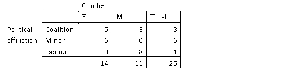 b.
b.
Component bar chart of gender, separated into political affiliation.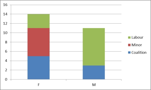 c. In this sample, females have a greater spread of political affilation between labour, coalition and the minor parties, with the minor parties having a slight majority. Whereas, males in this sample had a higher political affilation with Labour and none with the minor parties.
b.Component bar chart of gender, separated into political affiliation.
c. In this sample, females have a greater spread of political affilation between labour, coalition and the minor parties, with the minor parties having a slight majority. Whereas, males in this sample had a higher political affilation with Labour and none with the minor parties. 2
The wedges of a pie chart, if displayed as proportions, will sum to 1 or 100%.
True
3
Which of the following best describes a component bar chart?
A)A component bar chart represents all categories within a single bar.
B)tioned The height of each component is proportional to the frequency of the category that it represents.
C)When Component bar charts may be used as a comparison of two or more breakdowns as an alternative to using two pie charts.
D)All of these choices are correct.
All of these choices are correct.
4
Which of the following best describes a bar chart?
A)A chart in which vertical bars represent data in different categories.
B)A circle subdivided into sectors representing data in different categories
C)A chart in which vertical bars of unequal widths are usually used.
D)A chart in which vertical bars usually have no gaps between them.
A)A chart in which vertical bars represent data in different categories.
B)A circle subdivided into sectors representing data in different categories
C)A chart in which vertical bars of unequal widths are usually used.
D)A chart in which vertical bars usually have no gaps between them.
فتح الحزمة
افتح القفل للوصول البطاقات البالغ عددها 17 في هذه المجموعة.
فتح الحزمة
k this deck
5
Which of the following is a graphical technique used to present nominal (categorical) data?
A)Bar chart.
B)Pie chart.
C)A bar chart and/or a pie chart.
D)None of these choices are correct.
A)Bar chart.
B)Pie chart.
C)A bar chart and/or a pie chart.
D)None of these choices are correct.
فتح الحزمة
افتح القفل للوصول البطاقات البالغ عددها 17 في هذه المجموعة.
فتح الحزمة
k this deck
6
A bar chart is a graphical display of a nominal (categorical) variable. The reason for the gaps between the bars is to emphasise that the bars can be placed in any order as the variable is categorical.
فتح الحزمة
افتح القفل للوصول البطاقات البالغ عددها 17 في هذه المجموعة.
فتح الحزمة
k this deck
7
Which of the following statements is true?
A)All calculations are permitted on nominal (categorical) data.
B)A contingency table lists the counts of each combination of the values of the two variables.
C)Bivariate refers to the distribution of one variable.
D)A contingency table cannot be based on two nominal variables.
A)All calculations are permitted on nominal (categorical) data.
B)A contingency table lists the counts of each combination of the values of the two variables.
C)Bivariate refers to the distribution of one variable.
D)A contingency table cannot be based on two nominal variables.
فتح الحزمة
افتح القفل للوصول البطاقات البالغ عددها 17 في هذه المجموعة.
فتح الحزمة
k this deck
8
Which of the following statements about pie charts is false?
A)Pie charts can only be used for nominal data.
B)Pie charts are usually used to display the relative sizes of categories for qualitative data.
C)Pie charts always have the shape of a circle.
D)The area of each slice of a pie chart is proportional to the relative frequency of the corresponding category.
فتح الحزمة
افتح القفل للوصول البطاقات البالغ عددها 17 في هذه المجموعة.
فتح الحزمة
k this deck
9
Voters participating in a recent election exit poll in a Queensland electorate were asked to state their political party affiliation. Coding the data 1 for Coalition, 2 for minor parties and 3 for Labor, the data collected were as follows: Create a bar chart to display the political party affiliation in the Queensland electorate. Write a short sentence to describe the political affiliation.
Create a bar chart to display the political party affiliation in the Queensland electorate. Write a short sentence to describe the political affiliation. فتح الحزمة
افتح القفل للوصول البطاقات البالغ عددها 17 في هذه المجموعة.
فتح الحزمة
k this deck
10
Given the following five categories and the number of times each occurs, construct a pie chart and a bar chart.
فتح الحزمة
افتح القفل للوصول البطاقات البالغ عددها 17 في هذه المجموعة.
فتح الحزمة
k this deck
11
Which of the following statements is true?
A)A contingency table may also be called a cross classification table
B)A contingency table is used to describe two nominal variables.
C)A bar chart may be used as a graphical display of a contingency table.
D)All of these choices are correct.
A)A contingency table may also be called a cross classification table
B)A contingency table is used to describe two nominal variables.
C)A bar chart may be used as a graphical display of a contingency table.
D)All of these choices are correct.
فتح الحزمة
افتح القفل للوصول البطاقات البالغ عددها 17 في هذه المجموعة.
فتح الحزمة
k this deck
12
When a comparison of two breakdowns is desired, component bar charts offer a good alternative to using two pie charts.
فتح الحزمة
افتح القفل للوصول البطاقات البالغ عددها 17 في هذه المجموعة.
فتح الحزمة
k this deck
13
Identify the type of data for which each of the following graphs is appropriate.
a. Pie chart.
b. Bar chart.
a. Pie chart.
b. Bar chart.
فتح الحزمة
افتح القفل للوصول البطاقات البالغ عددها 17 في هذه المجموعة.
فتح الحزمة
k this deck
14
If the focus is to compare the size or frequency of various categories, a bar chart may be appropriate. Pie charts are effective whenever the objective is to display the components of a whole entity in a manner that indicates their relative sizes.
فتح الحزمة
افتح القفل للوصول البطاقات البالغ عددها 17 في هذه المجموعة.
فتح الحزمة
k this deck
15
A pie chart is always preferable to a bar chart, when describing a nominal variable.
فتح الحزمة
افتح القفل للوصول البطاقات البالغ عددها 17 في هذه المجموعة.
فتح الحزمة
k this deck
16
Car buyers were asked by a car dealer to rate their level of satisfaction with the service they had
received. The four ratings were Excellent (E), Good (G), Satisfactory (S) and Unsatisfactory (U). The
following data were obtained.
a. Create a bar chart of the level of satisfaction with the service.
b. Create a pie chart of the level of satisfaction with the service.
received. The four ratings were Excellent (E), Good (G), Satisfactory (S) and Unsatisfactory (U). The
following data were obtained.
a. Create a bar chart of the level of satisfaction with the service.
b. Create a pie chart of the level of satisfaction with the service.
فتح الحزمة
افتح القفل للوصول البطاقات البالغ عددها 17 في هذه المجموعة.
فتح الحزمة
k this deck
17
Construct a pie chart for the sample of 200 business school graduates is shown in the following table.
فتح الحزمة
افتح القفل للوصول البطاقات البالغ عددها 17 في هذه المجموعة.
فتح الحزمة
k this deck
فتح الحزمة
افتح القفل للوصول البطاقات البالغ عددها 17 في هذه المجموعة.